I’ve been fascinated by data visualisation for a year or two now, and I’ve recently been chatting to my good friend Iman about doing something with our circulation data. In particular, something that will be visually interesting to look at, whilst also giving you a feel for the data.
I’ve tried a few different things, but the Dewey Blobs are currently my favourite…
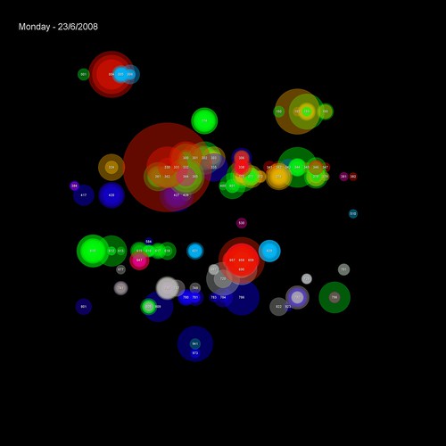
(items borrowed on 23rd June)
The transactions are placed on a 32×32 grid based on their Dewey classification (000-999). Each transaction is shown as a semi-transparent circle with two attributes:
1) colour — based on the School the student making the transaction studies in
2) size — based on the popularity of the book (the larger the circle, the more times it’s been borrowed before)
Where many students from the same school borrow from the same Dewey classification on the same day, the colour is reinforced. If the borrowing is from multiple schools, then the colours begin to blend to create new hues.
For example, on this day the vast majority of transactions in the 300s were by Human & Health students (green)…

…but a couple of days later, the borrowing in the 300s is more complex, with students from several schools appearing (Business students are red and Music & Humanities students are blue)…

You can browse through a few of the blobs on Flickr.
12 thoughts on “Dewey Blobs”
Comments are closed.
I always love the way you mash-up data visually. Very cool!
Hi, I’m guessing you that you chose a 2D grid for 1D data in order to save space but this does have the drawback of meaning that some numbers that are right next to each other appear a long way from one another on the screen eg, the blobs for 384 and 382. A cool way to get round this problem is to plot your points a long a single line which you then fold up along a space-filling curve http://en.wikipedia.org/wiki/Space-filling_curve
The Hilbert curve (see wikipedia link above) turns out to be particularly successful at keeping similar numbers closely grouped.
Thanks Tom — might give that a go! Looking at the Hilbert curve, it appears to double the number of points on each axis on every iteration, so there should be a curve for 32×32. Amazingly, there’s even a suitable Perl module available 🙂
I’ll have a play around with using a Hilbert curve tonight, but here’s what the Dewey layout would be. As a 32×32 grid gives 1024 points, that leaves a bit of a gap at the end of the curve.
I’ve added a version using the curve to Flickr.
You can use the slideshow function to compare and contrast the layout.
If you’re struggling to see the flow, then here’s a crude drawing to show where the blocks are.
I’ve added another version to Flickr which uses an offset of 12 to the start of the curve. This smoothes out the boundaries between each block of 100.
Heh heh — how could I not resist turning it into a movie? 🙂
[youtube http://www.youtube.com/watch?v=UDQ5uZE1Sv0%5D
One more variant — this one links together items that were borrowed at the same time.
So, if I’d borrowed a 005 and a 130 at the same time, there’d be an arc joining both together.
It’s quite a busy graphic, so here’s a version without the blobs.